
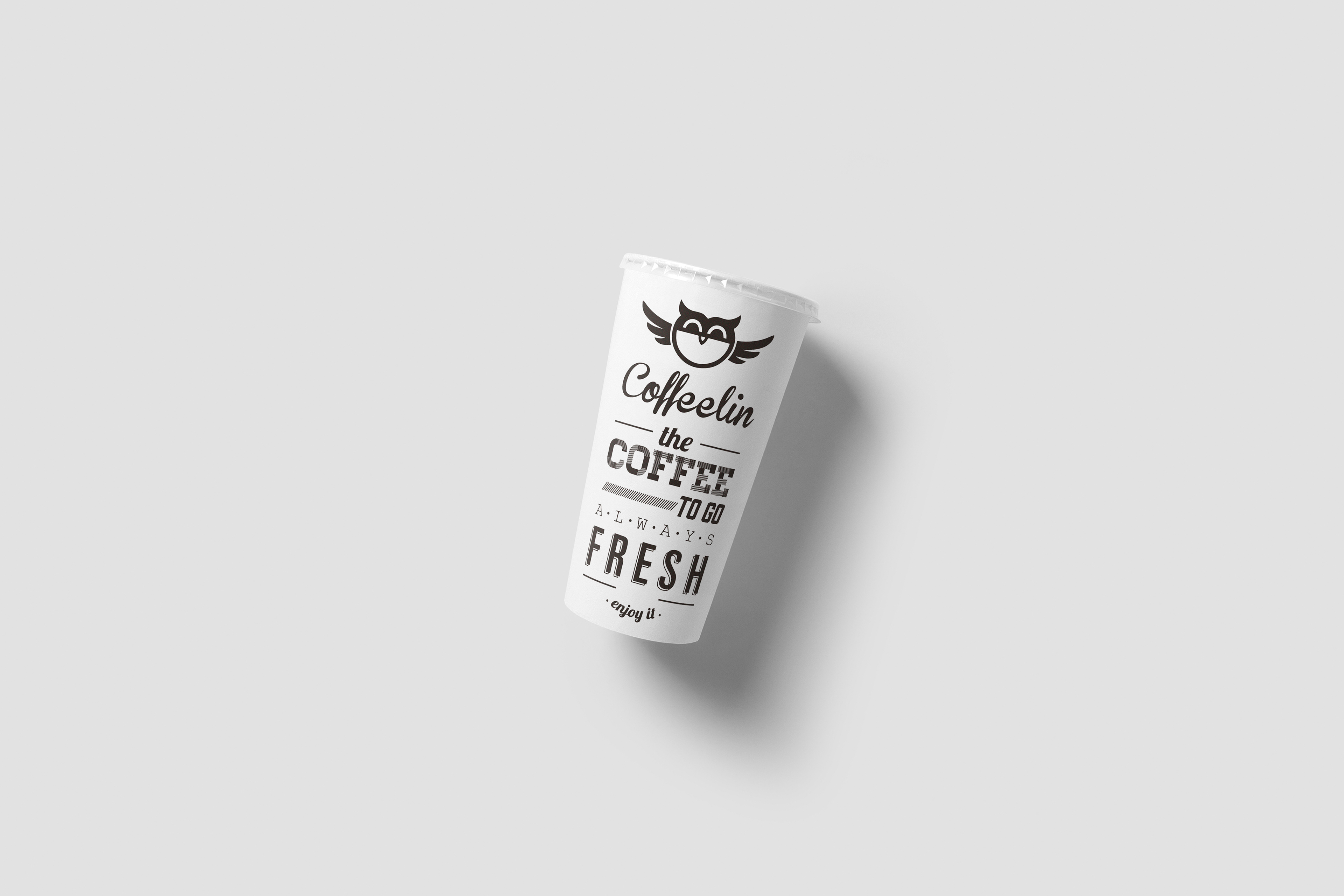
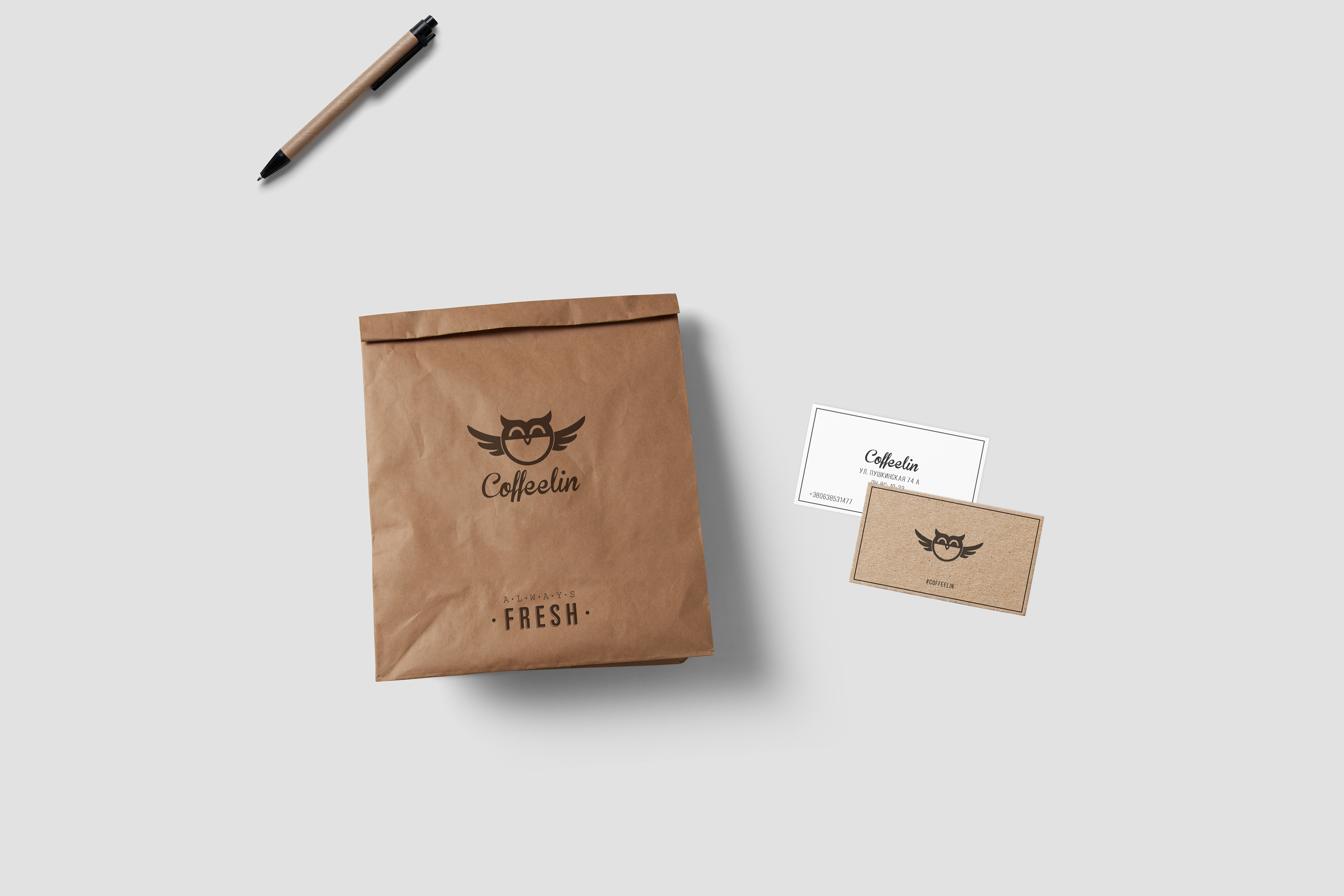
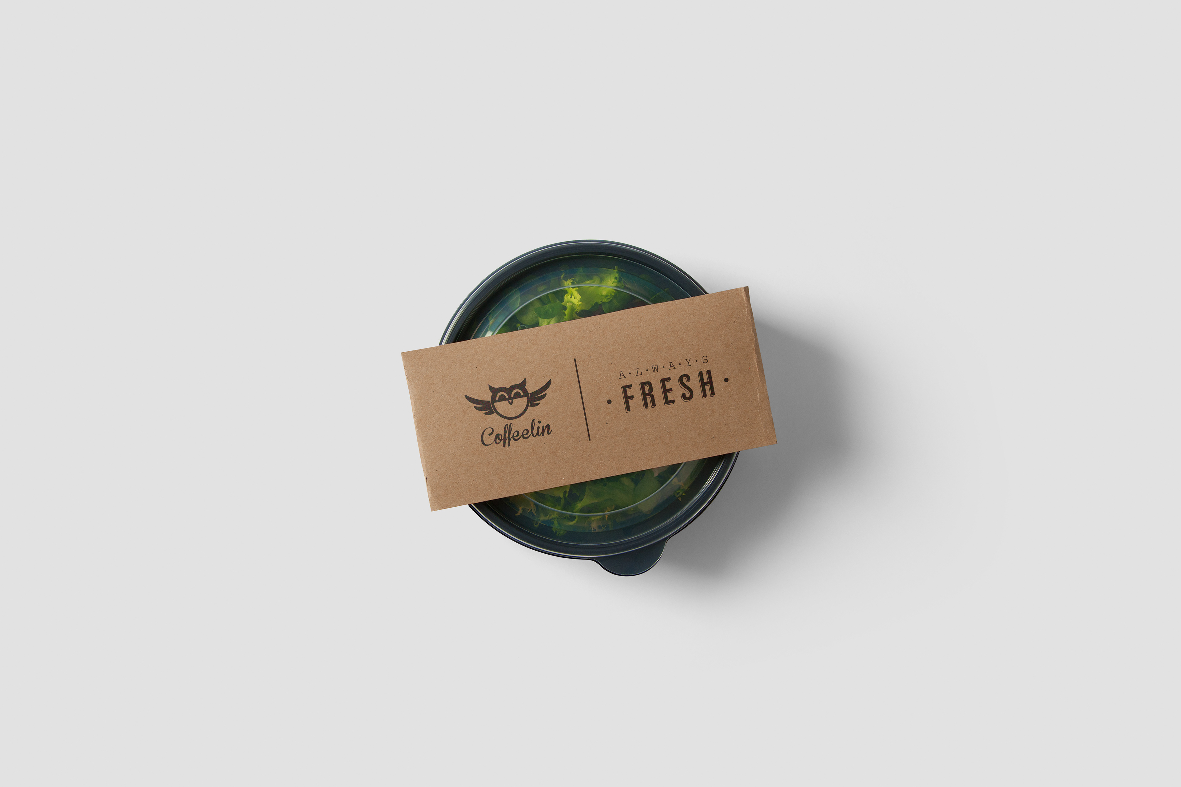
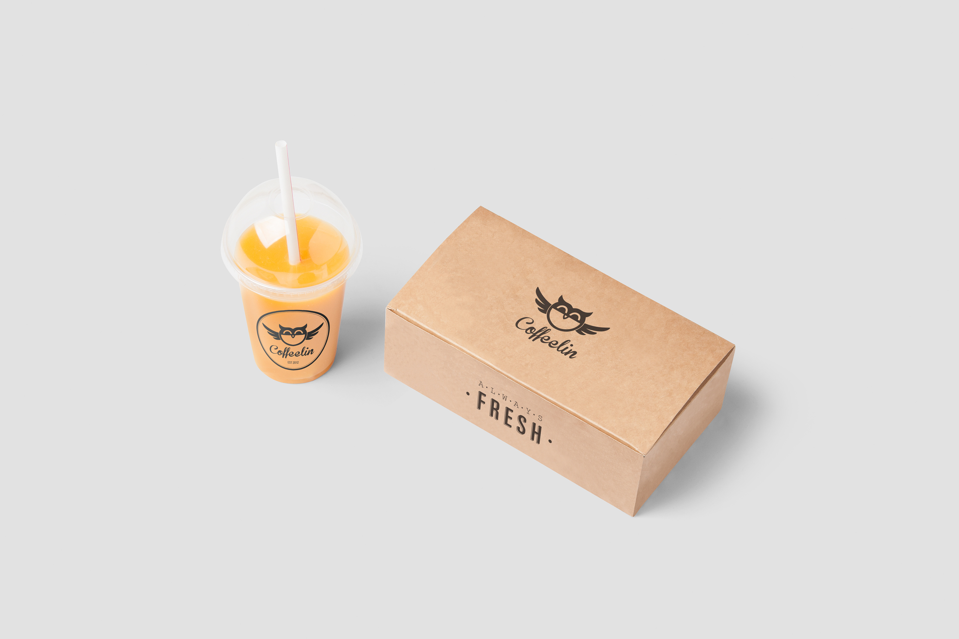
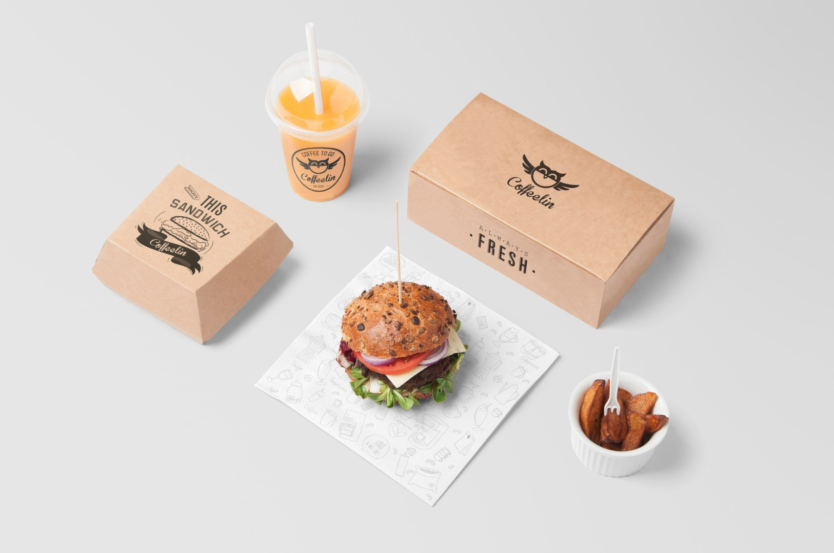
Developing the brand identity for the “Coffeelin” coffee house we’ve decided to avoid using the standard and stereotypical images like a steaming coffee cup contour. After a conversation with our client, we’ve understood that most customers visit the “Coffeelin” to wake up and to get a certain boost of energy. Thus an image of an owl appeared - this night bird resembles all the people who experience difficulties in waking up every morning. The text in the logo is written in a friendly calligraphic typeface. In general, the logo turned out to be very amiable, attractive and full of kind self-irony.