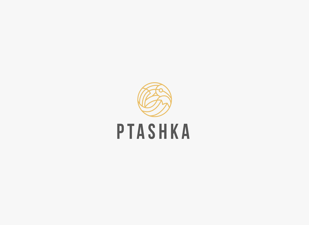
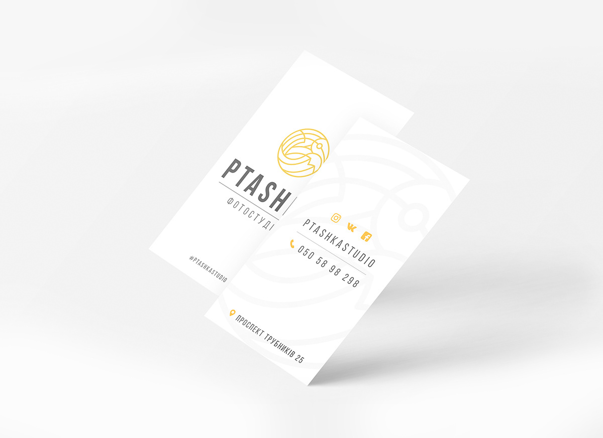
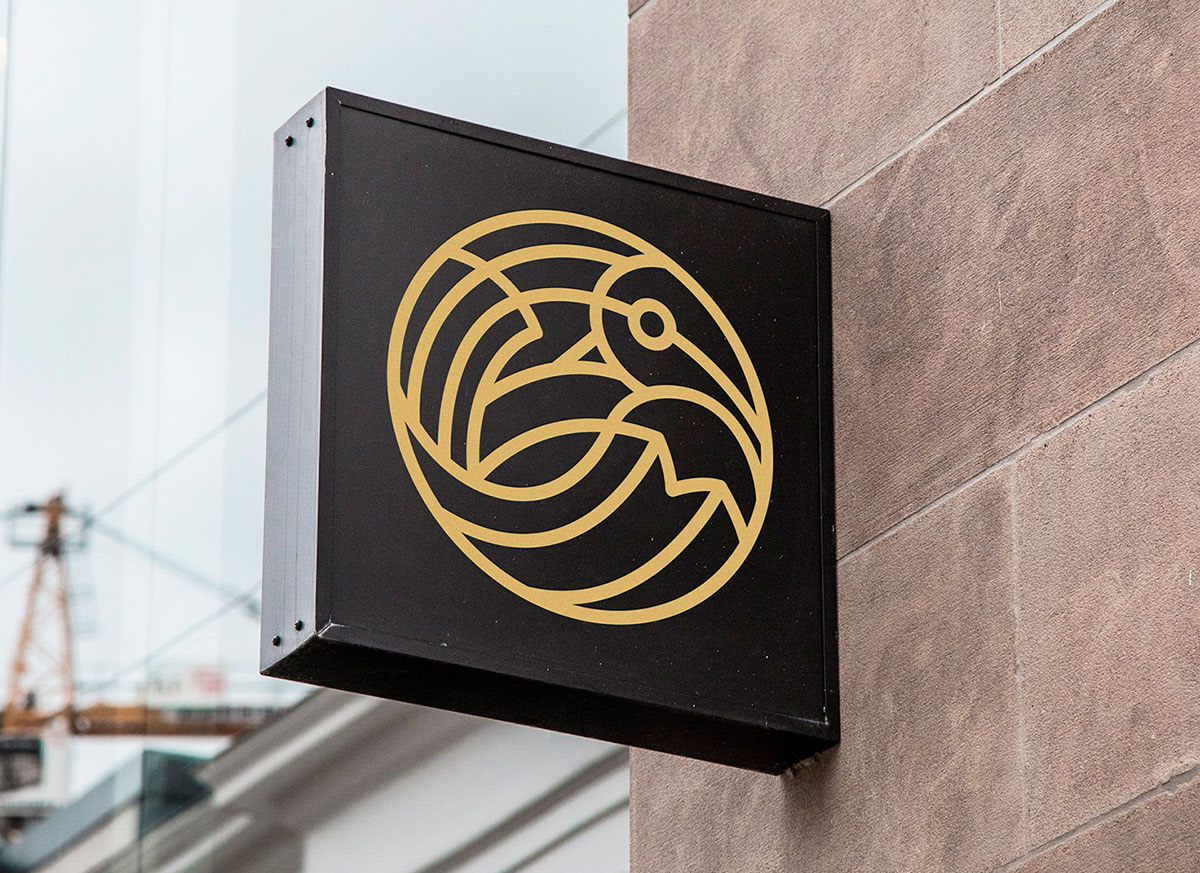
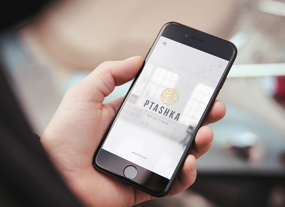
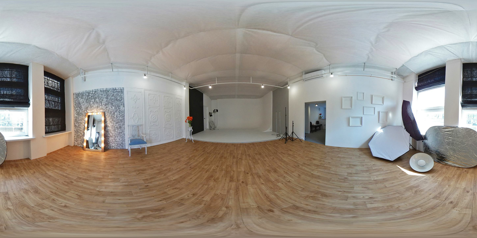
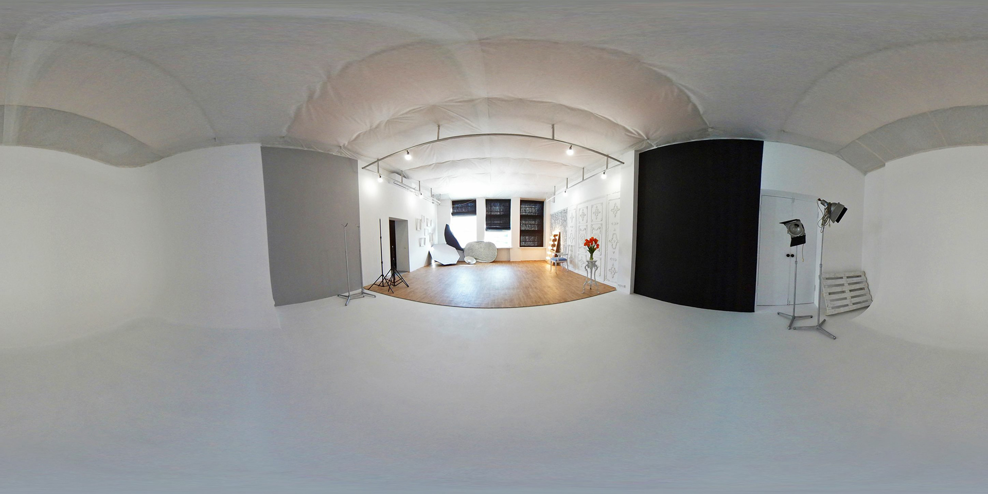
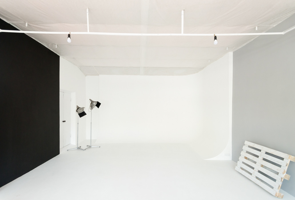
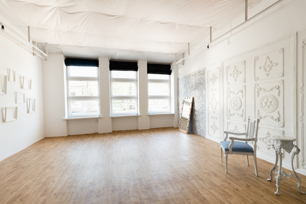
Developing the logo for the “Ptashka” photo studio I’ve combined the strict and elegant typeface with a creative sign. The non-standard drawing of the camera shutter that is made as a bird outline alludes to the proverbial “bird” that is associated with the moment a photography is taken. It not only shows the main client’s idea but it also gives an impression of the creative approach of the photographer, the fantasy and the non-trivial ideas - everything that the client wanted to express via the branding. The smooth and flowing lines add certain volume to the flat drawing. The palette will be easily used for the website design and the POS-materials development, as it also echoes the interior design of the studio and is easily recognizable.