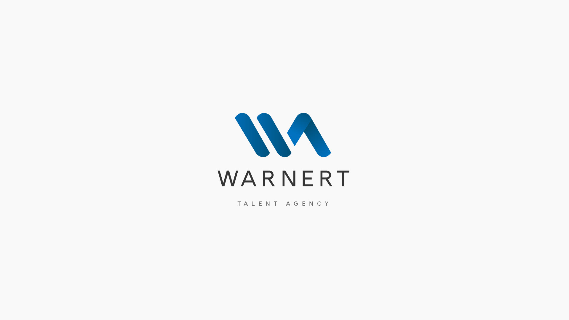
A laconic and recognizable logo for the WTA agency. The inclined lines add it some dynamics and more energy. The logo can be made in both monochromatic palette and with gradients - keeping in mind the unique outlines, the colors usage doesn’t affect the recognizability of the sign, which is also great for the copyright protection.