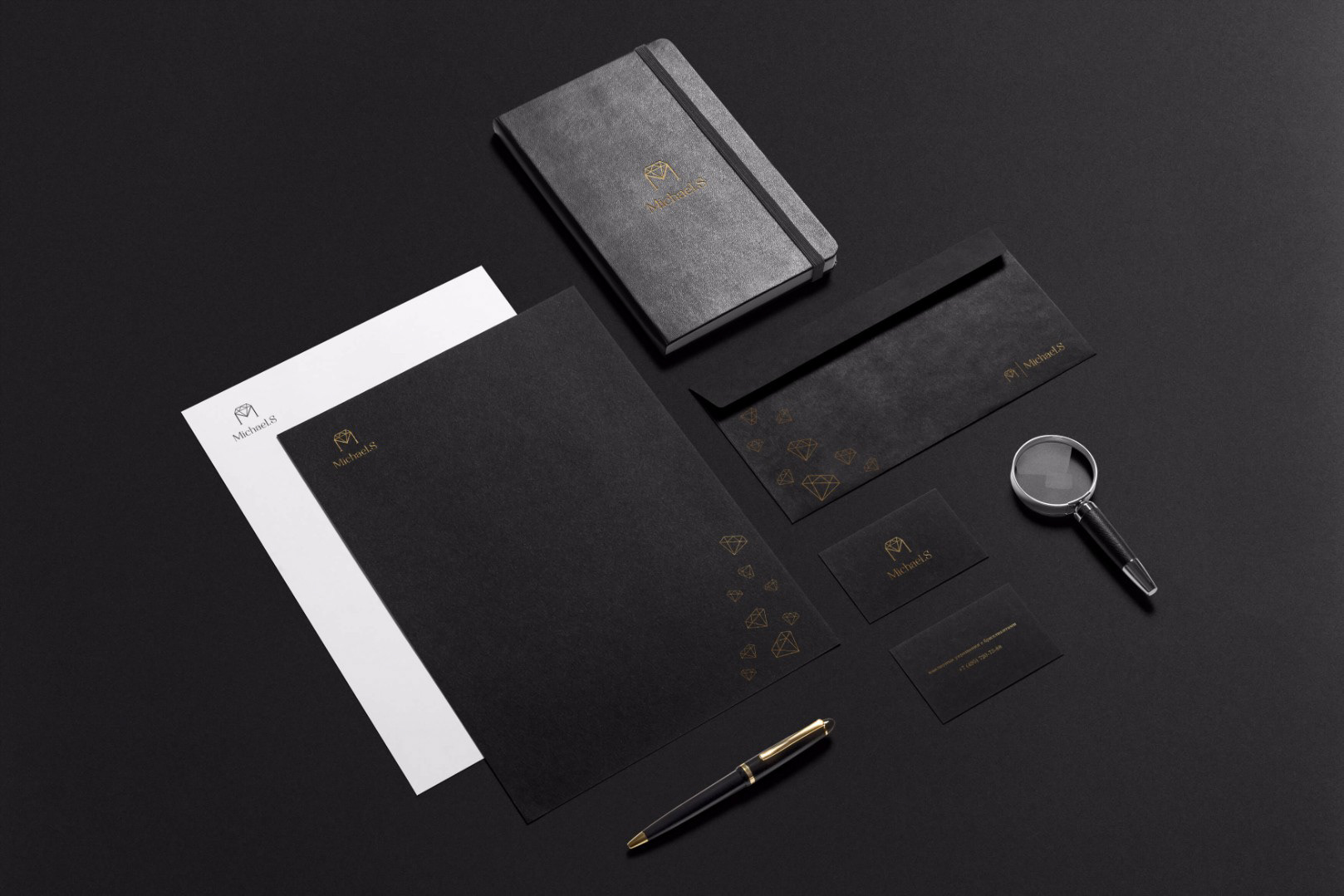

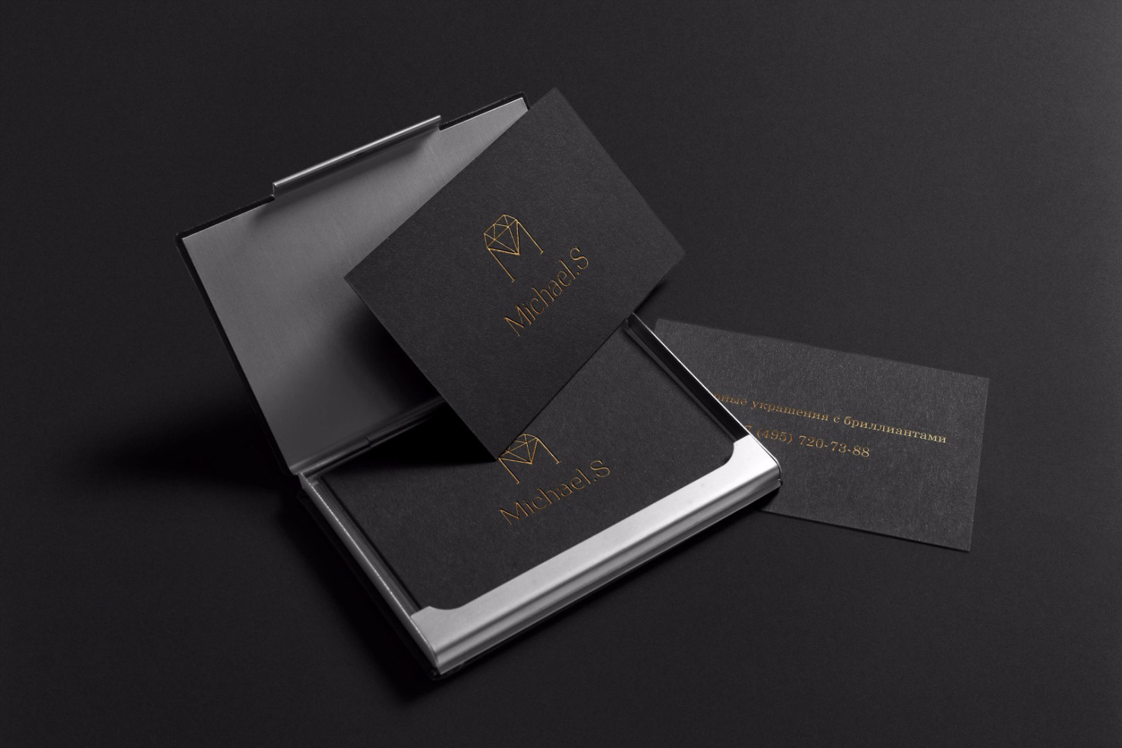
The jewellery brands identity is always rather conservative. I’ve chosen the minimalistic concept to make an impression of a modern, up-to-date brand. At the same time, I’ve chosen the monochromatic color palette to emphasize the portliness and the prestige, having added the gold embossing as an expected detail for the category. The tall font-face with serifs echoes the logos of the fashion houses. The crisp lines of the diamond in the logo and the footing on which it’s located, make an impression of the reliability and the stability that the client wished to implement in the logo design.