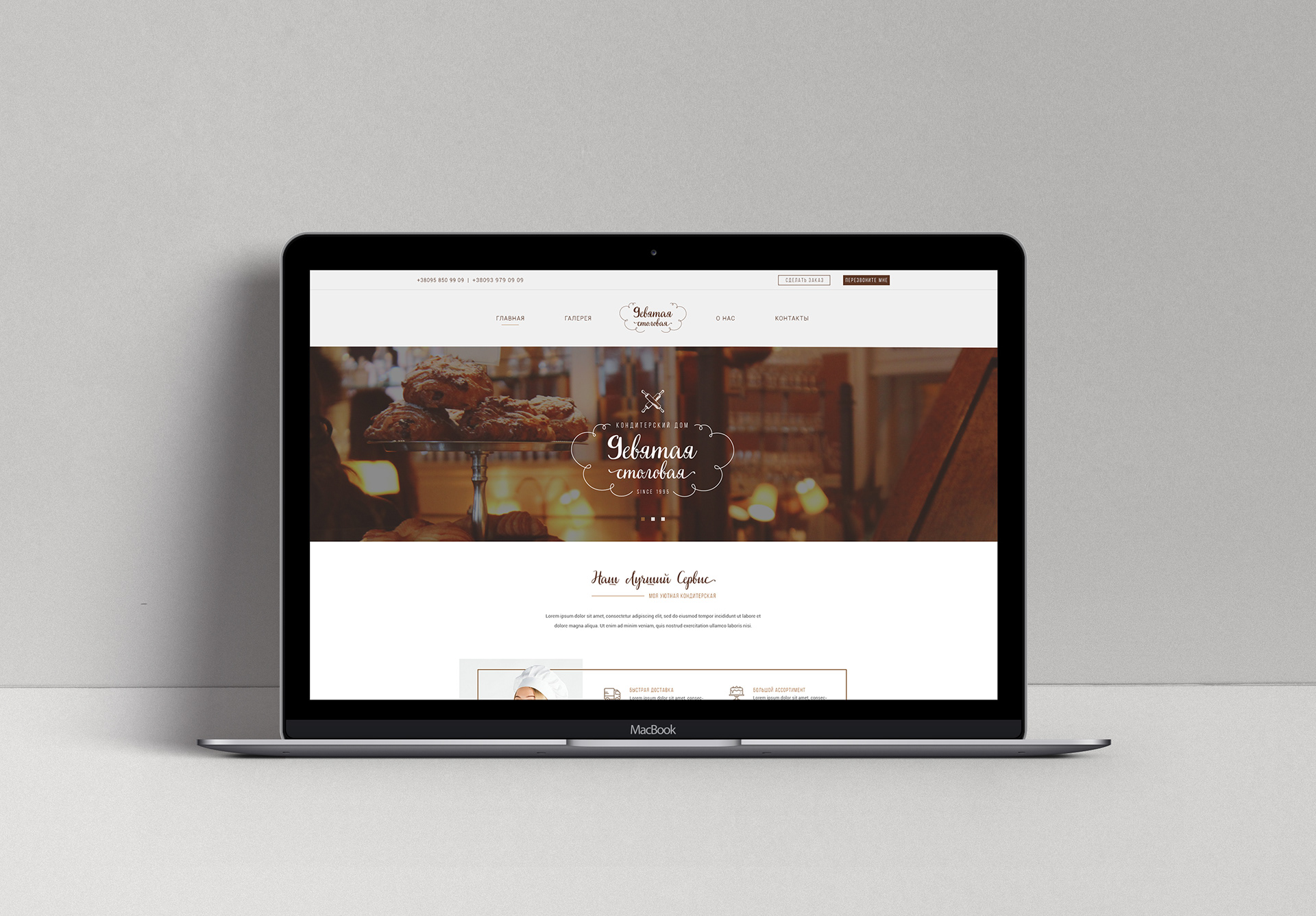


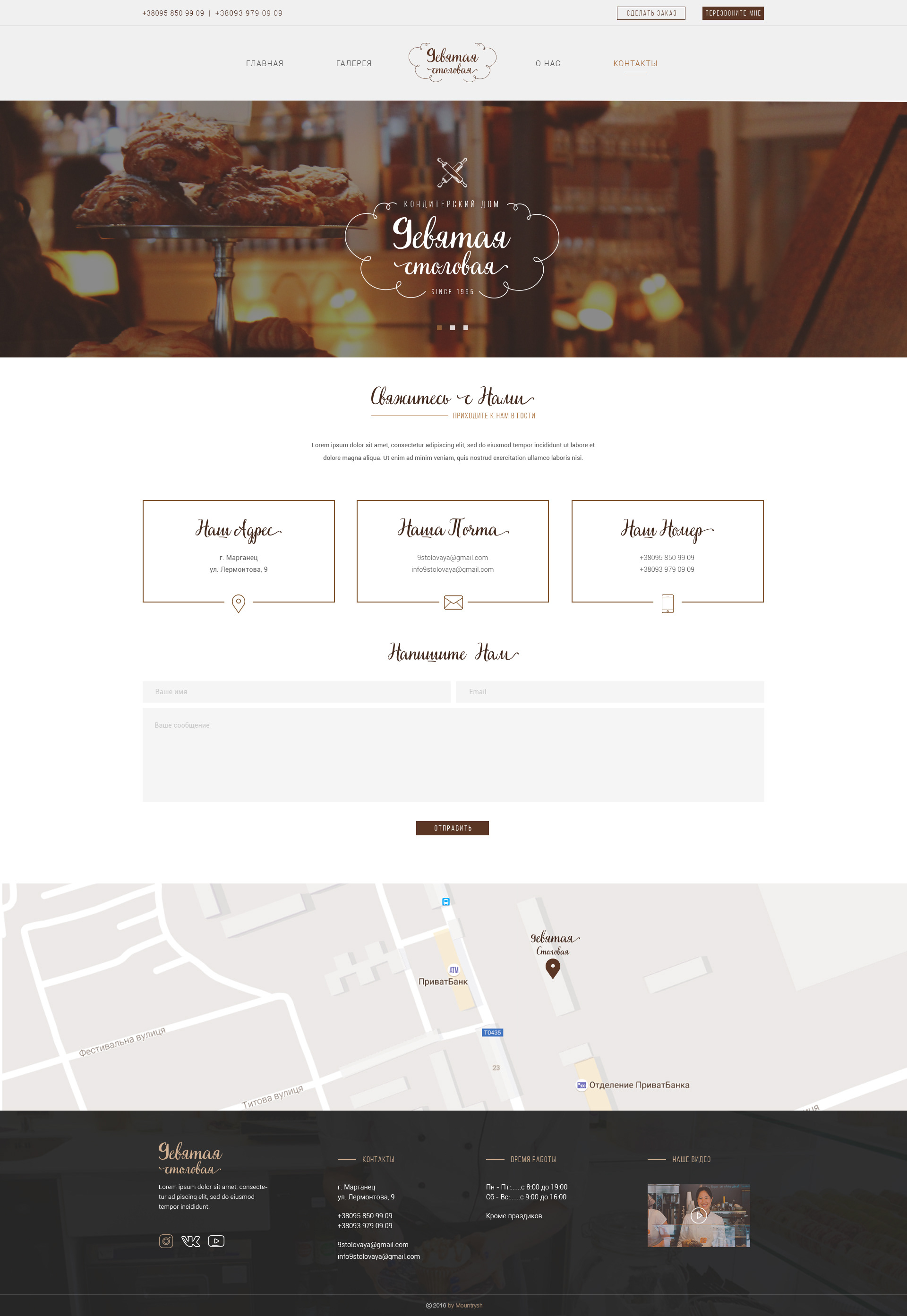
The pastry shops are strongly associated with the unhealthy or even junk food and the weight gain, so we have decided to help our customer in working with objections. I have used the exaggeratedly thin lines to create the atmosphere of lightness and weightlessness. The creamy tint of the background doesn’t distract the attention from the bright and attractive food photos. The stylized letter “D” in the logo helps to memorize and recognize the brand. I have also foreseen the version for the mobile devices so that our client’s customers could be informed and choose a dessert from the menu, look up the contact information, the map and the working hours even when they’re on the road.